
Disinformation and statistics: the case of Professor Abraham J. Wyner
On the 7th of March, Abraham J. Wyner, a professor of statistics and data science at the University of Wharton, published an article (archive) in Tablet magazine, claiming that the Gaza Health Ministry’s (GHM) casualty figures are entirely fabricated. His arguments rely on gross misrepresentation of the truth to reach his conclusion. Wyner’s article serves as a good example of the disinformation campaign the Israel-Gaza war has brought about, so let us consider his perspective. This article is written directly in response to his, so I would recommend reading his first to ensure that I am not misrepresenting him.
The crux of Wyner’s argument is that the GHM’s reported casualty figures are suspiciously consistent day by day during the two-week period between 26/10/2023 and 10/11/2023 when the GHM published daily updates. To illustrate his point, he plots the cumulative fatalities over this two-week period and demonstrates it to be increasing at shocking linearity (graph shown below). Based on this he concludes that there is insufficient variation in the data as should have been expected, and that it is therefore “statistically impossible”.
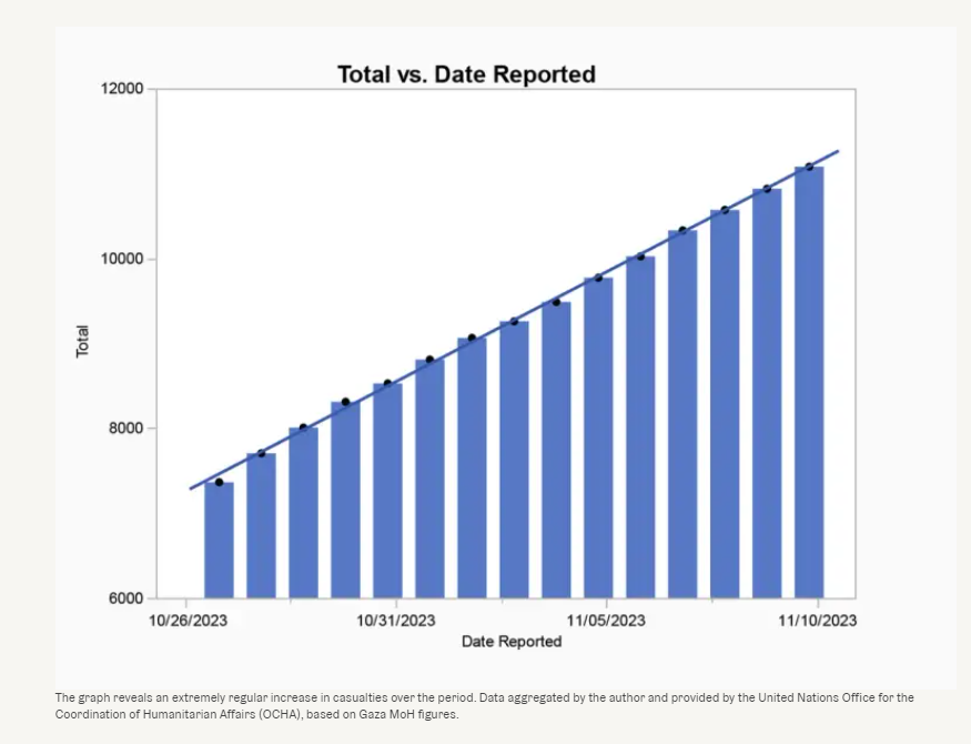
This graph does not follow from the hypothesis. His initial claim was that daily fatality counts should vary, and not that cumulative fatality counts should vary. To illustrate, consider the graph below (fig. 1), with shocking linearity.
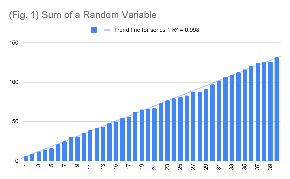
These are the cumulative sums of 40 six-faced dice rolls. Did Hamas cook my dice as well? No. Simply, the cumulative sum of random observations tends towards the expected value of those observations, since variance cancels out in the long term. For a different perspective, consider rainfall, a quasi-random occurrence. Predicting rainfall for a specific day in the far future is impossible, nevertheless, the cumulative rainfall over a year is highly predictable. That is, I can say with high confidence that the cumulative average rainfall across Pennsylvania this year will be 37-44 inches, with no information about rainfall occurrence on any day and despite having never stepped foot across the Atlantic.
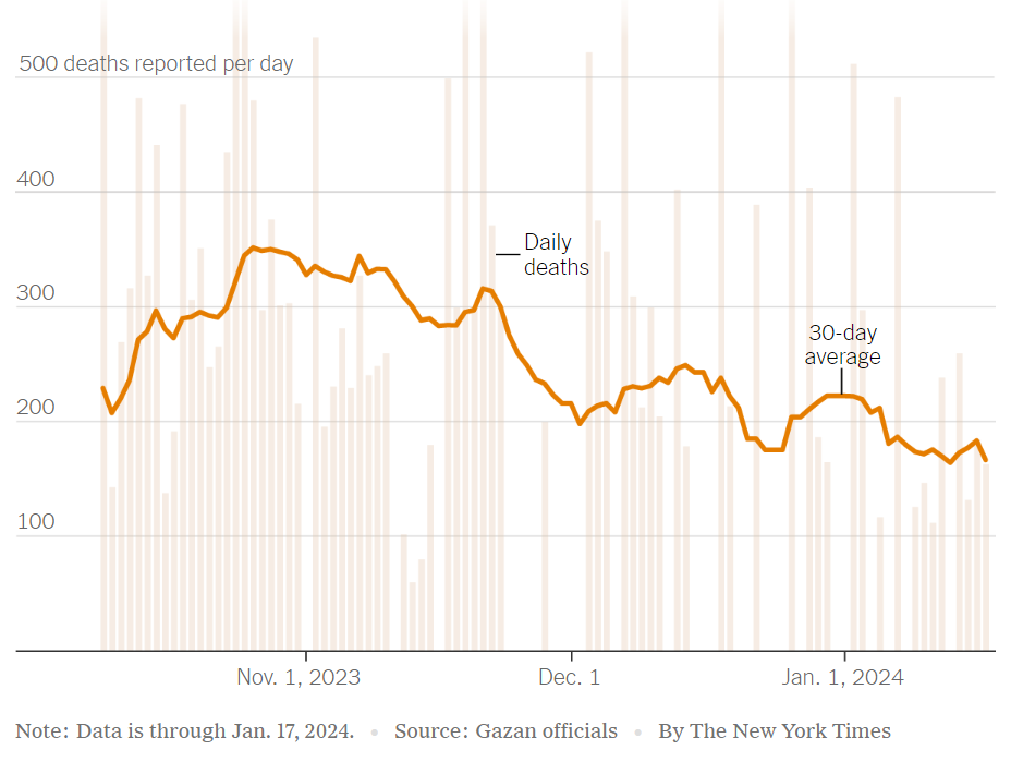
What we should be interested in instead is the variance between the daily observations. Firstly, we can reproduce Wyner’s chart more accurately. The chart below (fig. 2) shows the daily deaths reported by the GHM. Presented as such, we can quickly see that Wyner’s claimed “lack of variance” was largely an artefact of his misrepresentation.
This still does not give us an accurate picture of what the variance between the observations is. To do so, we require a visualisation of the dispersion of the dataset. Assuming no major escalations or de-escalations, we should expect to see that over a short period of time these observations would follow something of a normal distribution, with most days having an average number of deaths, and fewer having higher or lower. The average of the observations is 270, and the standard deviation is 42. We can use this to create buckets and see how the data varies. This is shown in the chart below (fig. 3).
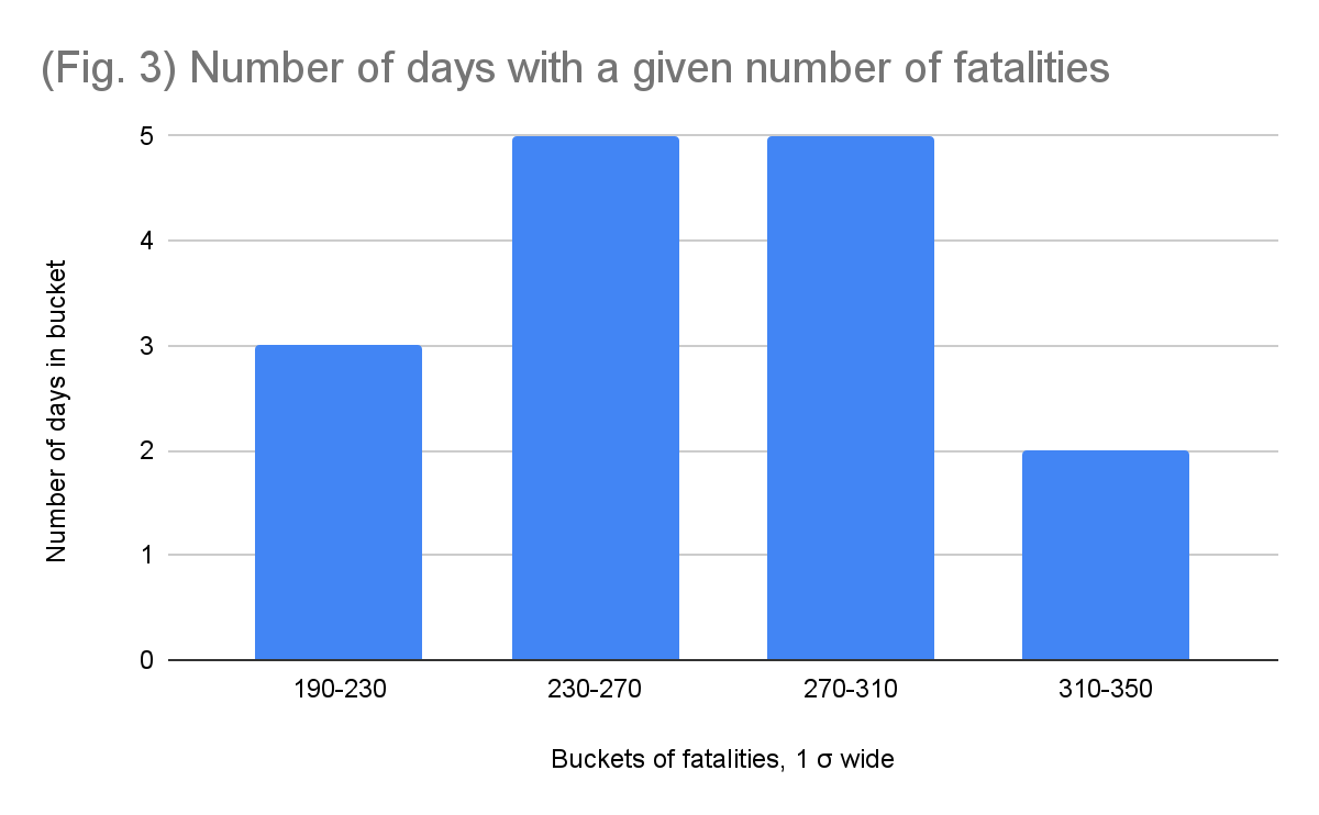
As expected, the dataset does appear to follow something of a normal distribution, with 10 of the days falling within one standard deviation from the average, and 15 falling within two. This even passes the 68–95–99.7 test. Nevertheless, a dataset of 15 observations is far too small to make any precise predictions about the shape of the distributions. However, it most definitely cannot be used to reach the opposite conclusion of these figures being made up, as the variance appears quite reasonable for what we should expect.
In the article, Wyner does point out the relatively normal distribution of the figures in the most duplicitous way possible:
“In fact, the daily reported casualty count over this period averages 270 plus or minus about 15%. This is strikingly little variation. There should be days with twice the average or more and others with half or less.”
The 15% he refers to is ~40, roughly our standard deviation. This is an intentionally misleading statement to a lay audience unfamiliar with statistics. The implication he misleads his audience towards is that the range of the daily deaths is 270 ± 40, and not that the 15% is the standard deviation.
Regardless of the deceit, this is the first and only time Wyner makes a verifiable claim beyond misrepresented charts, so we ask: is a standard deviation of 15.6% “strikingly little variation”? The answer is no — this is a reasonable amount of variance for a 15-day period of war where Israel was engaged in a consistent, high-intensity ground invasion. Searching for points of comparison from other wars is difficult – almost no government agency reports daily fatalities during a war. The closest I could find was a dataset of weekly deaths during the US invasion of Iraq, which will suffice for this exercise. The graph below (fig. 4) takes the period of 13 Apr 2003 - 28 Dec 2008 and shows the standard deviation over 15-week periods as a percentage of the average for that period. That is, we take the average fatalities over every 15-week period, calculate the standard deviation for that period, and then plot it as a percentage of the calculated average.
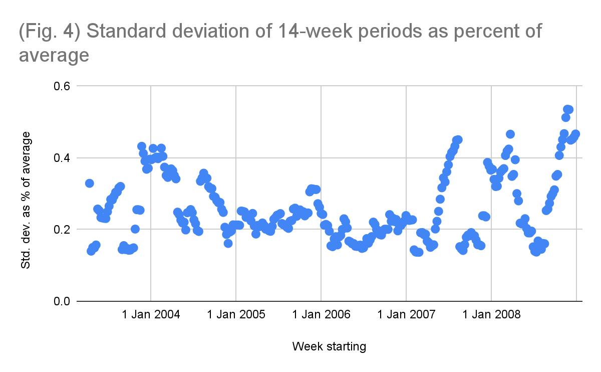
Note that this graph over-represents the variance compared to our dataset, since the 15-week period we use is 3.5 months, where actual changes in intensity of battle are much more visible. Our dataset does not have such transition periods. It is simply two weeks of Israeli ground invasion with no change in strategy and is therefore most akin to the lower, more stable points in the figure above. In either case, 11% of the 15-week periods taken in the Iraq war have a standard deviation of less than 15.6%, i.e. less variance than our dataset. So yes, a standard deviation of 42 over a two-week period where daily deaths averaged 270 is incredibly reasonable and would not seem unexpected to anyone who works with such data. With regards to his second claim that we should observe some days with twice the average of deaths: this only occurred 6 times in the 299 weeks of the Iraq war observed. There are no weeks in the dataset where the deaths fall below half of their 15-week average. War has variance, but it is not an arbitrary roll of the dice as Wyner would have you believe.
Here’s the thing: Wyner knew this data had a reasonable amount of variance, but he could not show you the data more accurately as it would not have allowed him to reach the conclusion he desired. I do not for a moment believe that a data science professor in an Ivy League university “forgot” how variance works or how it could be visually represented accurately. This was a deliberate attempt at deception to spread disinformation, which is unfortunate for someone of his calibre to be caught doing. You know how else I know this was a deliberate lie? Because if he zoomed out on his graph this is what it would look like:
Wyner flipped a coin 100 times, picked a series of five heads in a row, and exclaimed “The coin must be weighted”. The worst part yet, his blatant disinformation was rather successful. The titles that got reprinted were “Respected statistician questions number of deaths in Gaza” and “Hamas casualty numbers are ‘statistically impossible’, says data science professor". This man successfully used his position in academia to lie and knowingly spread falsehoods about an ongoing war — what an absolute disgrace.
Some other notes
I mainly wrote this article to expose the aforementioned statistical misrepresentation Wyner employs, but we can entertain the rest of his claims while we are here. He provides two additional arguments, the first showing that the rate of children’s deaths is uncorrelated with the rate of women’s deaths and the second showing that the rate of women’s deaths and “implied men’s” deaths are negatively correlated. For both, he notes that we should see a positive correlation since deadlier days should be deadlier for all. Curiously, to establish these correlations he used the daily deaths, not the cumulative sum — almost as if he suddenly remembered what the correct methodology for establishing correlations and determining variance is.
Regardless, this is unconvincing due to the nature of the figures published by the GHM. The GHM publishes three figures: fatalities of “confirmed children”, fatalities of “confirmed women”, and total fatalities. The number of men is not independently published and therefore the value Wyner has to use is the total less women and children, reaching his “implied men” statistic. This is problematic, since what if, due to failing infrastructure and other difficulties, the GHM is unable to process the dead in due time and therefore the subcategories, when published, are incomplete? That is, on any given day it is relatively easy for the GHM to publish total deaths, but identifying the gender of hundreds of corpses experiencing different levels of decay and mutilation is likely to take longer. Under such conditions, as you identify more women, the number of unidentified and therefore “implied men” would go down. This would indeed show a negative correlation with the “implied men” but it would only be because the “implied men” are turning out to have been women. The data is suggestive of this perspective, as there are two days with no reported women fatalities, despite both days having 250+ fatalities.
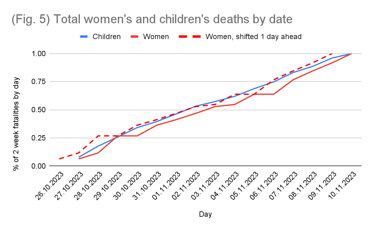
This identification problem can best be visualised by comparing it to children’s deaths. Children's corpses, even fragments, are easier to identify owing to their size, so their daily reporting is much more likely to be accurate and timely. This can be used to find out if there is a delay in women’s fatality reporting. We take the total number of women’s and children's deaths and normalise the cumulative sums for both to 100% so that they would be comparable. In the graph below (fig. 5), the solid red and blue lines represent the cumulative percentage of women's and children's deaths respectively by any given day, based on GHM figures. The dotted line represents this same data for women, shifted one day ahead to counteract the identification time it may take for them. Presented as such, it becomes quite apparent that the data reported by the GHM for women is simply retroactive. This delay is responsible for the lack of correlation between women's and children's deaths.
This isn't an artefact of fabrication, it is an artefact of identification. Identifying the gender of a corpse takes longer than identifying its age, which in turn takes longer than identifying that it is indeed a corpse. This also results in the apparent “negative correlation” between women’s and “implied men’s” fatalities, since when women are identified they get pulled from the “implied men” pool. In essence, these correlational tests cannot by themselves tell us anything regarding the veracity of the figures; all they do is confirm that one cannot tell the chromosomal makeup of a corpse upon first glimpse of it, which isn’t exactly a novel discovery (unless your name is Sari Essayah I suppose).
Wyner expands on his logic regarding women’s and “implied men’s” fatalities further:
“Consider some further anomalies in the data: First, the death count reported on Oct. 29 contradicts the numbers reported on the 28th, insofar as they imply that 26 men came back to life. This can happen because of misattribution or just reporting errors. There are a few other days where the numbers of men are reported to be near 0. If these were just reporting errors, then on those days where the death count for men appears to be in error, the women’s count should be typical, at least on average. But it turns out that on the three days when the men’s count is near zero, suggesting an error, the women’s count is high. In fact, the three highest daily women casualty count occurs on those three days.”
Wyner has here misattributed all unconfirmed deaths that are not women and children to be men, and has blamed this misattribution on the GHM. 26 men did not come back to life — they turned out to have been women, and at no point did the GHM make a claim to the contrary. Indeed, two out of the three deadliest days for women occur directly after a day with no women’s deaths reported. The days with few “implied men” have high women’s fatalities precisely because those are the days when a lot of the “implied men” from prior days have been identified to be women retroactively. This is why your statistics professor, if they aren’t Wyner, will drill into your head the trouble with using endogenous variables (endogeneity shown in the appendix).
Additionally, these inconsistencies and delays in records of corpses seem to suggest an honest attempt at reporting. After all, if these were fabrications, why wouldn’t the ministry just have the numbers consistently go up? Why would they report a day with no women dying since that would garner limited sympathy? This is an odd aspect of Wyner’s article, he seems to believe that the GHM has no understanding of “naturally occurring numbers” but never takes pause to consider why the numbers might look weird in the first place. To Occam’s razor this, which of the following sounds more plausible: that the GHM is lying about the number of deaths but is so incompetent at lying that they fabricate days with no women’s fatalities and others with negative men’s fatalities that would intentionally make their position look worse, or, that it may simply take more than a day to process the gender of hundreds of corpses?
Wyner's article also serves a greater point about the problem with the pro-Israel position. In order to continue supporting Israel you would have to admit publicly that you are in favour of the starving and constant shelling of millions of civilians with unclear goals. That's a tough position to hold. So… you don't. You spread misinformation instead. You say Hamas did it. Or that not a perfect fatality count was produced. Or that a specific event is just made up wholesale. Israel's war crimes from massacres to manufactured famine are so heinous that the only position you can defend is one where they don't exist. This is also, not incidentally, the position of the Israeli government. Spreading propaganda and resting assured that it will not be challenged since the military took care of the journalists and international observers aren’t allowed entry. It always comes back to this. For Israel and her supporters, this is a war for public opinion. It will always be a war for public opinion. Denial is the backup plan when someone still manages to report on your war crimes.
Wyner, with absolutely no sense of irony, even alludes to this information problem in his article:
“[...] international observers who were able to monitor previous wars are now completely absent, so the past can’t be assumed to be a reliable guide.”
I wonder why Wyner? Mightn’t it have something to do with the military you support preventing their entry and their operations? What a joke.
All of that being said, I do not for a moment believe that the GHM’s numbers are perfectly accurate — anyone who does has a severe misunderstanding of what warzones look like. Inaccuracies in death tolls are par for the course in wartime, but to claim that these figures are outright fabricated is an incredible leap of logic based on wisps of circumstantial evidence. These are reasonable, best estimates given the current conditions, and they should be treated as such. For comparison, on the 14th of October, a week after the Hamas-led assault, Israel reported 1400 fatalities, which was, throughout the following months, revised down to 1139. This in a developed nation with highly functioning infrastructure that had completely regained control of its interior within days. It would be disgraceful to attempt to deny the 1139 real deaths because of “inconsistencies in reporting”. Now, imagine the GHM attempting to give daily reports while actively being shelled. To use expected inaccuracies in reporting to dismiss atrocities of war is wicked behaviour. It is genuinely unfortunate that Wyner allowed his personal convictions to overcome his mental faculties. He knew better and yet he lied. Shame.
Appendix: endogeneity
This section is a short clarification of the endogeneity problem mentioned above.
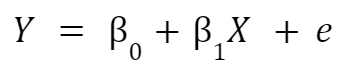
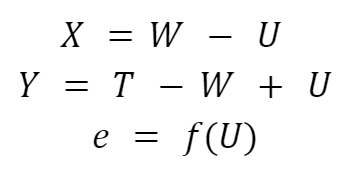
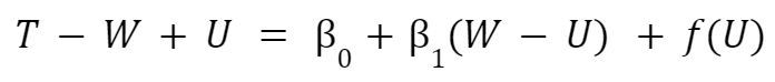
Let Y be the number of “implied men’s” deaths, T be the total deaths, and X the number of confirmed women’s deaths. Due to the identification errors, let U be the number of unidentified bodies that turn out to be women, W be the real unobserved number of women’s deaths, and M be the real unobserved number of men’s deaths. Consider the main source of error in our error term: unidentified bodies. Our error term, e, is therefore a function of the unidentified bodies f(U). The OLS regression conducted by Wyner is:
Where:
Wyner's regression is therefore of the form:
[Here, place these everywhere above: iiiiiiii]
This regression is an absolute mess. The independent variable of confirmed women’s deaths is directly correlated with our error term, hence endogeneity. The dependent variable of “implied men’s” deaths is directly correlated with our error term, hence maximal heteroskedasticity. Worse yet, since the relationship between X and Y depends on the rate at which women’s corpses are identified on any given day, this relationship isn’t even linear. If I suggested conducting such a regression to any of our professors I’d be sent back to principles of empirical analysis.

